How to create non-intrusive overlays that convert

Overlays can be powerful conversion tools when they seamlessly enhance the shopper journey – the key to success lies in creating non-intrusive overlays that engage users without disrupting their browsing experience.
Here are 10 tips to drive optimal results:
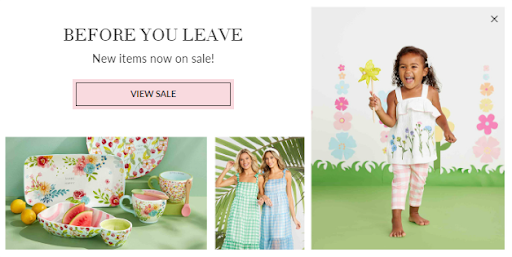
1. Timing is everything: Avoid bombarding visitors with overlays the moment they land on your site. Instead, use time-delayed triggers or wait until users have engaged with your content. Exit-intent overlays can be particularly effective, appearing only when a user is about to leave.

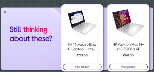
2. Relevance is crucial: Ensure your overlay content is highly relevant to the page the user is viewing or their browsing history. Personalised, context-aware overlays are more likely to be perceived as helpful rather than intrusive, and drive the desired result.

3. Easy dismissal: Always provide a clear, easily accessible way to close the overlay. Avoid using deceptive or guilt-inducing language for the close option. Respect the user’s choice to opt out.
4. Mobile optimisation: On mobile devices, screen real estate is limited. Design overlays that are easy to read and interact with on smaller screens, and consider using less intrusive formats like bottom banners.

5. Frequency capping: Limit how often a user sees your overlays. Implement a system that remembers when a user has dismissed an overlay and doesn’t show it again for a set period.
6. Seamless design: Create overlays that complement your site’s design and wider marketing campaigns rather than clash with them. A cohesive look feels less disruptive to the user experience.
7. Consider size and positioning: Overlays shouldn’t take up too much screen space or distract from the main content. Play around with the size and shapes of overlays to maximise engagement. They don’t have to be front and centre – consider side or bottom banners, or animations to capture attention.
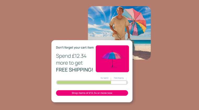
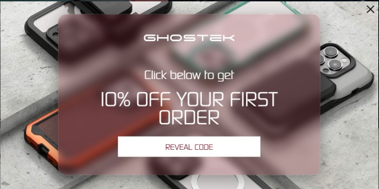
8. Value-first approach: Offer something of genuine value in your overlay, such as a discount code or other incentive like free shipping. The message could also remind them how to qualify for these offers, such as spend x amount to unlock the incentive. When users perceive benefit, they’re less likely to feel intruded upon.

9. Performance optimisation: Ensure your overlays load quickly and don’t slow down your site. Sluggish overlays can frustrate users and negatively impact their browsing experience. Clear CTAs will keep users on the desired shopper journey.
10. Continuous testing: Regularly A/B test different aspects of your overlays as outlined above, including timing, design, and messaging. Use the data to refine your approach and find the sweet spot between conversion and user experience.
By following these guidelines, you can create overlays that effectively convert without alienating your audience. Remember, the goal is to enhance the user experience, not hinder it. When done right, non-intrusive overlays can be a powerful tool in your conversion optimisation arsenal.
intent.ly’s team of CRO experts, designers and intelligent tech tools make all of this easier than ever – book a demo today to see how we can help your brand convert more traffic.

Amy is intent.ly’s marketing manager, and she has 15 years’ experience working in marketing for global events and technology.
